
I decided I’m making a series of these because they’re fun. Here’s a new cover tutorial! This one’s for a bright, splashy, printed-looking cover. My goal with these tutorials is to use my hobbyist Photoshopping skills to create something simple and easy that still looks cool.
You can check out my last cover tutorial for links on where to find a free (legal!) copy of Photoshop CS2, which can be used to do everything you see here. The other tutorial also has links for where to find cool font and design bundles. This tutorial assumes you have a basic working knowledge of the program, but if you have no idea, there are lots of beginner’s guides on YouTube.
On to the good stuff!
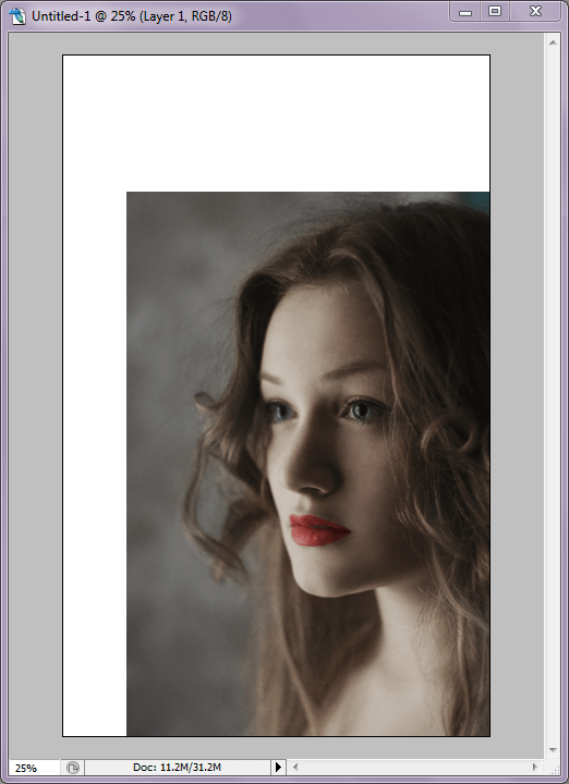
First, create a new image as your cover base with the appropriate dimensions and DPI (File > New). Once you have that, pick an image to use. I selected a girl against a simple background from Unsplash, which is my fave. An image with clear lines, good contrast, and a simple background works best for this. Resize the image as necessary and drag it onto your cover base. I usually duplicate the image layer so I always have an original for reference (Layer > Duplicate Layer) then hide it (the little “eye” icon next to the layer on the Layer menu).
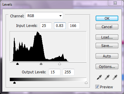
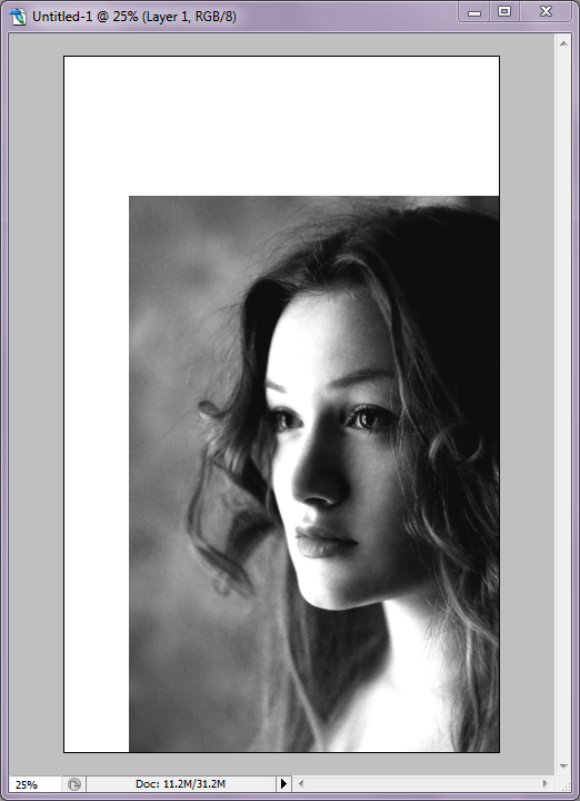
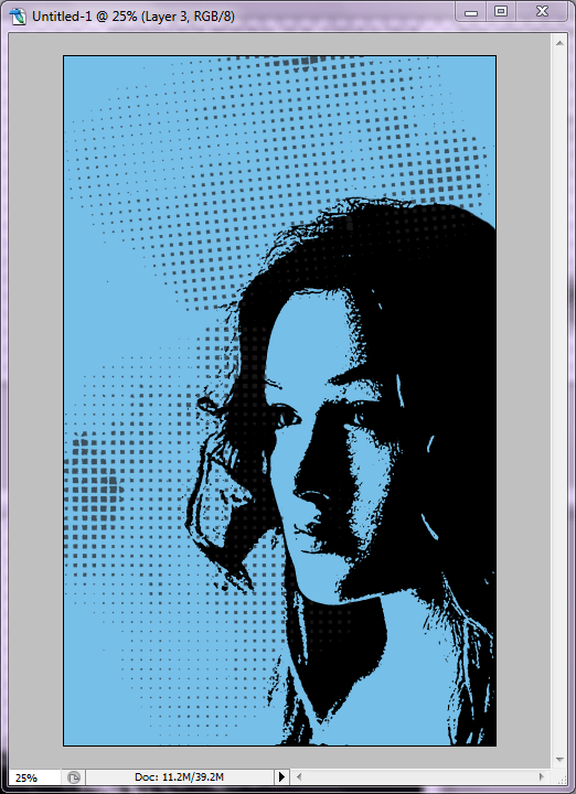
Now you’re going to desaturate the image (make it black and white). You can do this through the menus (Image > Adjustments > Desaturate) or by using the keyboard shortcut Shift+Ctrl+U, assuming you’re on a PC. Once your image is desaturated, you’re going to adjust the levels (Image > Adjustments > Levels). For my particular image, I use the settings below, but they may have to be adjusted for yours. You’re going to want to drag the markers until you’re image looks good and high-contrast, which usually means moving them to where the “spiking” starts and tweaking from there. Play with it until you get the result you want. You can always cancel and start again.
You can see the desaturated image with the Levels adjusted below.
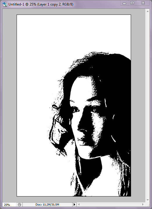
Right on. If your colors aren’t set to default black and white, reset them real quick either with the keyboard shortcut Shift+D. Let’s apply a filter! You may be interested in playing with the different effects here to get something you like, but I wanted my cover to look printed or stamped, so I went with Stamp (Filter > Sketch > Stamp). You should be able to see a preview of the effect on your image, so play with the balance and smoothness until you get an effect you like (you can see what I did below).

Sketch Filters – Stamp
Here’s the image with the Stamp filter applied.

Now use the Eraser tool to clean up the “noise” around the subject. This is where having a subject that stands out against the background comes in handy, because there’s not too much to clean up.
OKAY. Now let’s add some color. Create a new layer (either click the “new layer” button on your layer menu or select (Layer > New > Layer). Fill the layer with a color of your choice (Edit > Fill). Set the Layer to “Multiply” on your layer menu, and now you have an overlay effect.

That’s a lot of empty space, so let’s add some interesting halftone elements. They fill the space without making the design too busy or complicated. These are from a design pack I got from one of the many, many design bundles floating around the internet — they’re easy enough to find, just look for “Halftone Vectors” or similar. I dragged the vector, positioned it where I wanted it, reduced the layer opacity to 70% so it wasn’t so dark (on the Layer menu), and then duplicated the layer and rotated it to fill another area (Edit > Transform > Rotate). Some of the pattern was covering my subject’s face, so I used the Eraser tool to clean it up.
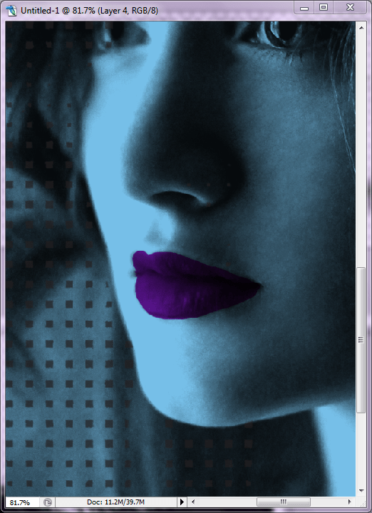
This is where having a copy of the original comes in handy. I wanted to add some additional color to my subject to make her pop, so I decided to create a new layer for some lip color. Set the new layer to “Multiply” on the Layer menu and select a color. I hid the Stamp layer and unhid the original (again, click the little “eye” icon next to the appropriate layers on the Layer menu). This way, it was easier for me to paint the color over the shape of her mouth using the Paintbrush tool. It doesn’t have to be perfect for this project. Once the color was applied, I hid the original layer and unhid the Stamp layer again.
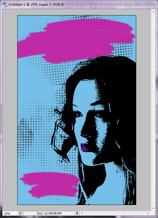
Create yet another new layer so we can add some brush effects. Photoshop CS2 comes with a number of preset brushes for the Paintbrush tool, and some of them are art brushes. I selected one with rough edges, chose a complementary color, and painted some large swaths like you see below. If the brush is too small, you can increase the diameter on the Paintbrush menu bar at the top of the work area. Once I had my paint swaths, I decreased the opacity just a tiny bit to 90% so I could just barely see the halftone pattern through the color.
Now it’s time for text! Select yet another complimentary color and add your title and name using a nice font. You may want to put some words on their own layer so you can change font styles or position them where you want them.The fonts I used here are called BLACKHAWK and Canvas 3D.

Another cool think about BLACKHAWK font is that it comes with additional flourishes, so you can add swashes or splatters. I embellished a little with a few more splatters in yellow and pink for added effect. And… that’s it! You have a cover!

Next time around, I plan to start picking out covers I like and creating similar (but not exact!) styles. Do you have a suggestion? Let me know!
