
Another Tuesday, another cover design! This week, I thought I’d look at cool recent and upcoming YA covers and try my hand and creating a similar (but not identical!) design. Now that I’m getting in the groove, I’m going to skip most of the basics and assume you have at least a beginner’s working knowledge of Photoshop. If you’re new at this, feel free to check out previous tutorials for more detailed explanations.
When I saw the cover for Kami Garcia’s The Lovely Reckless, I thought it looked incredible. So I figured I’d use it as this week’s inspiration! I’ll be creating a cover in the same vein, but it won’t be an exact replica. This is intended as a how-to for style more than instructions on how to mimic a cover exactly! I recommend experimenting and coming up with something that’s all your own.
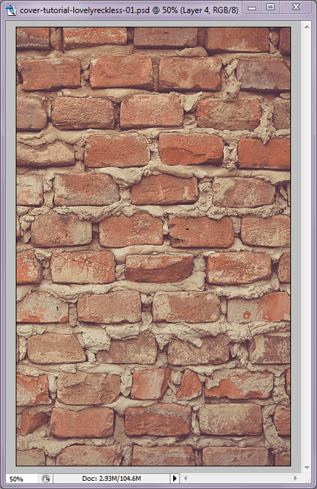
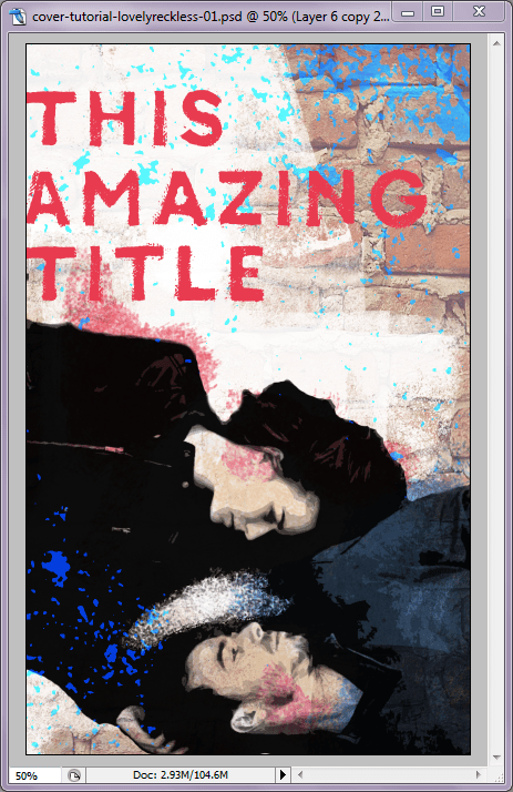
Onward! First things first: let’s pick out a base background for our cover. The Lovely Reckless uses a background of brick, so I went with that. Drag the image onto your cover base and resize as necessary. The image below, as well as other images in this tutorial, are from Unsplash, by the way.
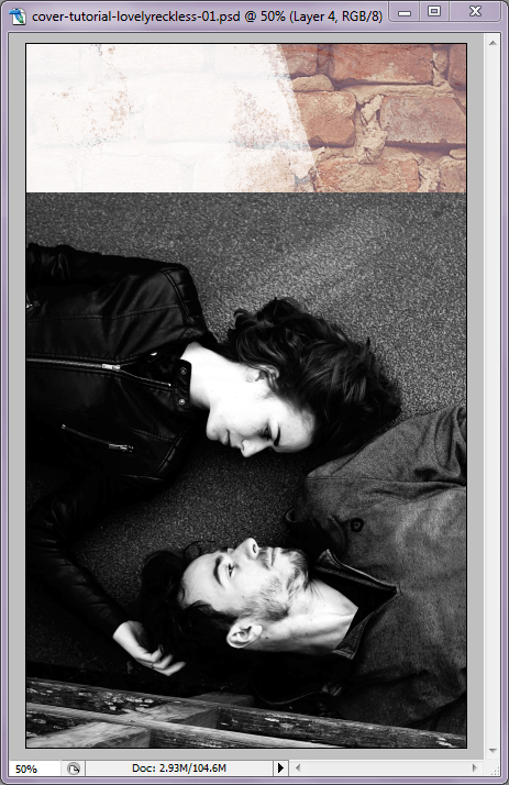
I wanted to break up the solid brick and wash it out a little, so I used an off-white marble texture from a design pack set to “Soft Light” (opacity 75%). On top of that, I layered on a white rolled ink texture from another design pack set to “Screen.” The ink texture only covered the lower half of the cover, so I duplicated the layer and rotated it to cover some additional area.

That makes for a nice base! Now I wanted to add in the subjects, so I selected an appropriate image, added it as a new layer, and resized/positioned as necessary.

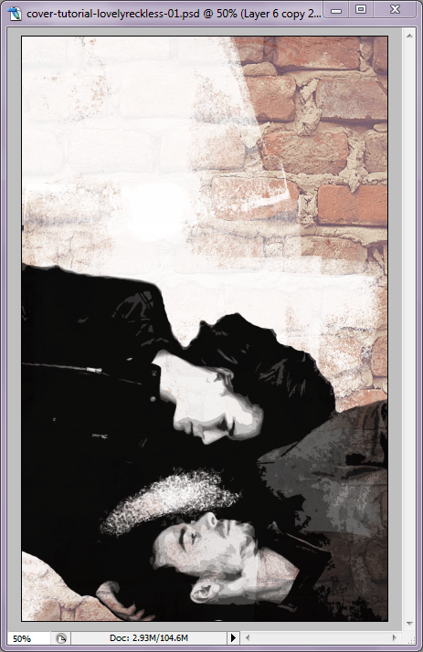
From here, the goal is to make the subjects look more illustrated/artistic, rather than a photograph. To start, I Desaturated the layer (Shift+Ctrl+U) and tweaked its Levels and Contrast.
Cool. Now I want them to look sort of like a poster or cutout, so I applied the Cutout Filter (Filter > Artistic > Cutout) and played with the settings until I had something that maintained some of the detail without looking too much like a photograph. From there, I used the Eraser tool to get rid of some of the background. I didn’t do the cleanest job, since this was just for a tutorial… her hair could be better. Anyway. You can use different brushes with the Eraser for different effects, which is how I carved out a little messy space between them. Once that was done, I set the layer to “Multiply” so some of the brick would come through.
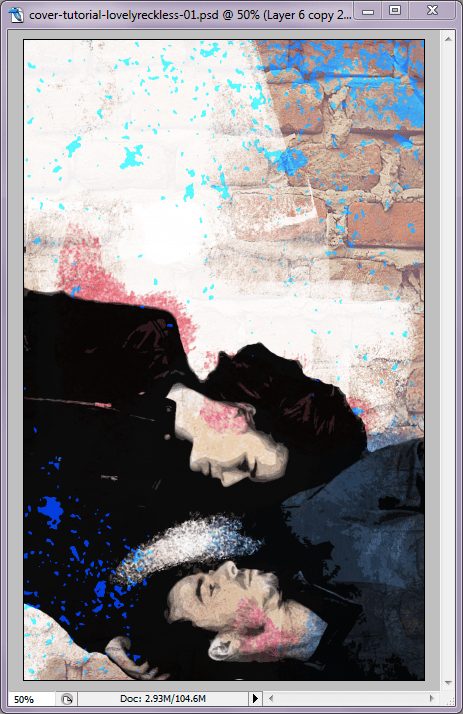
Now for some color and splatter effects. With a new layer set to “Multiply,” I colored in their skin, clothing, and hair. I also used a dappled brush to add a few bright splattery accents (again, could be better, but this was for tutorial purposes). I also added on another splatter texture from a texture pack — the bright blue, also set to “Multiply” with a color overlay.
Text time! Add in your title in an appropriate font and color. The font I used here is called Canvas Basic.
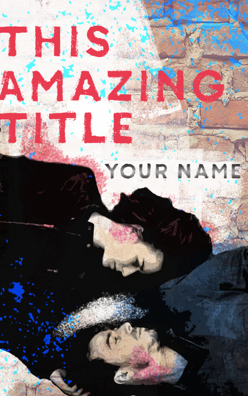
In smaller text (or not… your choice!), add your name. This time, I went into Blending Options on the text layer and added a Gradient Overlay set to Reflected at 90 degrees. Make sure the colors you want to use are selected on your Color Palette. And… that’s it! That’s the cover!
That’s it for this week. Hopefully this gave you some ideas! Have you seen a cool cover you’d like me to tackle? Let me know in comments!
