
Time for a new cover tutorial! This time, my inspiration is Lindsay Smith’s A Darkly Beating Heart, which sounds freaking amazing and I can’t wait to read it. As before, I’m writing this as if you have a working knowledge of Photoshop, but if you don’t, check out my earlier tutorials for more basic tips and info on how to download a free (legal!) copy of Photoshop CS2.
This is a for-fun tutorial where I try to recreate the general style of cool covers in Photoshop, and is not intended to produce an exact copy of an existing cover. Onward!
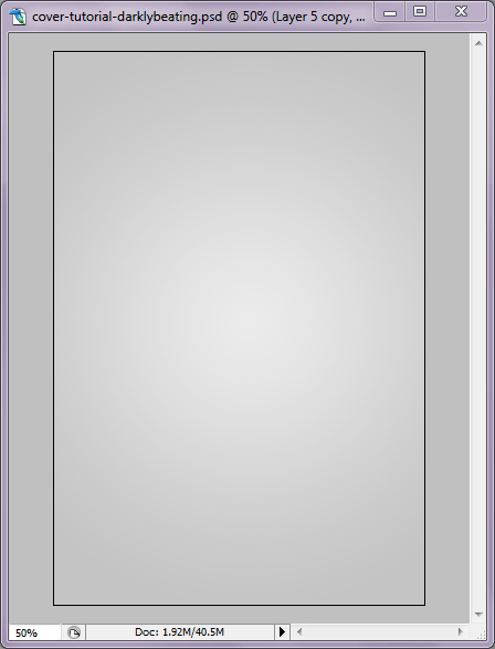
Start out by creating a new image document to serve as your cover (if you need appropriate dimensions, Google can help). Once you have your image created, add a new layer and use the Gradient tool to create a Radial Gradient with two shades of light gray, as shown below. You can tweak the shades of gray for a lighter/darker effect later.
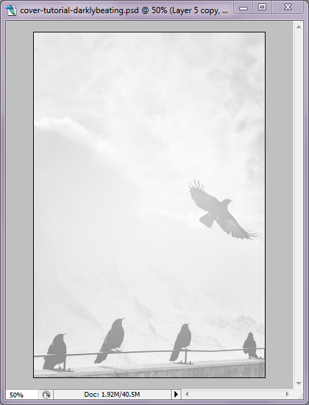
Using my fave Zero Creative Commons stock photo site, Unsplash, I picked out some appropriate photos to use. I decided on a scene with clouds and birds for the background. I dragged it onto my document, resized appropriately, and set the layer to Overlay on the Layer Menu. This creates a nice faded look over the gray layer.
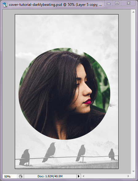
Using the Circle Marquee tool, I created a circle around the face of the subject I wanted to use (also from Unsplash) and dragged it onto my cover image. Then I resized it (Edit > Transform > Scale) as needed and positioned it above the birds.
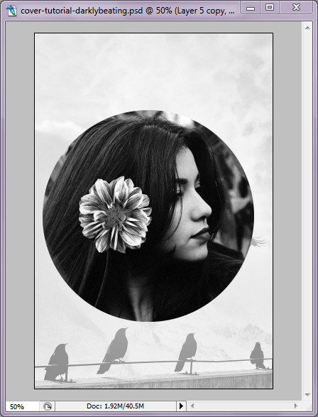
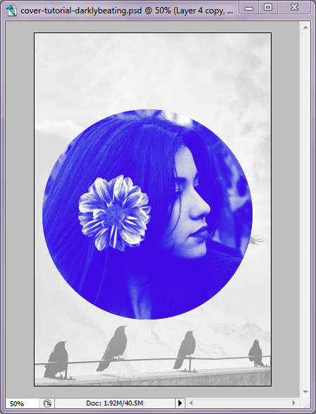
From here, I Desaturated the image layer (Shift+Ctrl+U), because I’m going to be layering another color on top. I also adjusted the Levels (Image > Adjustments > Levels) to make it pop more. I wanted to add a little more visual interest to the image, so I used another Unsplash photo of a flower to add to her hair, as seen below. I used the Marquee tool again to select the area I wanted, dragged it onto a new layer, and used the Eraser tool to define the edges. It’s also been Desaturated and had its levels adjusted.
From here, I used the Magic Wand tool on the girl’s image layer to select the area around the circle, then right-clicked inside the area and selected “Select Inverse,” which highlights the area inside the circle. Then I created a new layer and filled the circle marquee with a bright violet-blue (Edit > Fill). This new color layer was set to “Lighten” on the Layer menu. Then I duplicated the color layer, set the duplicate layer to “Multiply,” and reduced its opacity to 30%.
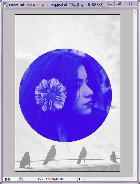
The girl looks too faded out now, so I duplicated her image layer (as well as the flower image layer) and placed them on top of the color, setting both to “Lighten.” So, the layers now look like this: Background, Gray Gradient, Birds Image, Girl Image, Flower Image, Blue Circle, Blue Circle Duplicate, Girl Image Duplicate, Flower Image Duplicate.
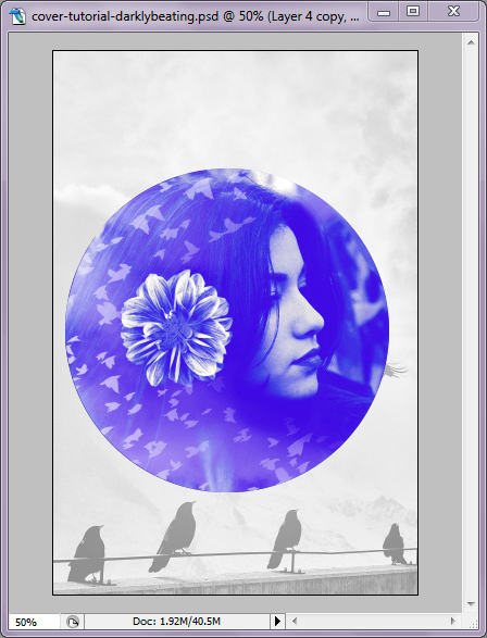
Using yet another image from Unsplash, I inversed the color (so the black birds became white birds), dragged the image to a new layer, deleted the portion I didn’t need using the same method as with the blue circle, and then set the layer to “Screen” at 75% opacity. Then, using either an Image Mask or the Eraser tool, you can remove some of the image obscuring her face and the flower.
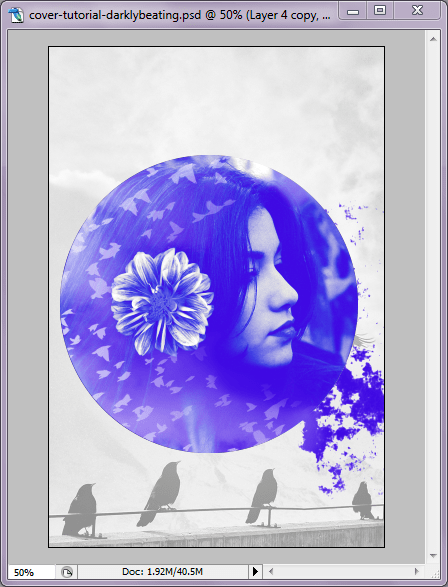
The splatter effect is from a design pack with paint/ink splatter designs, which you can find pretty much anywhere. I dragged it over, resized and rotated as needed, and erased the bits I didn’t need. From there, I used the Eyedropper tool to select a matching color from the blue image and copied the hex code, then added a Color Overlay in the splatter layer’s Blending Options. Then I used the Eyedropper again to select a lighter shade from the image and used the paintbrush tool to blend it together a little more.
Now for the text! The font I’m using here is called Twilight Script in varying sizes. Using different layers helps you to get a slightly de-centered effect. For the author name, I rotated the layer (Edit > Transform > Rotate) just slightly to line it up with the railing the birds are perched on.
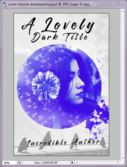
From here, I wanted to add a little distortion to the text, so I duplicated each of the text layers and Rasterized them (Layer > Rasterize > Type), then moved them below the original text layer. To the Rasterized text layers, I applied the following filters: Motion Blur, Sprayed Strokes, and Sharpen. All are under the Filter menu at the top of the screen. When those filters were applied, I used the Eraser tool to erase bits of the distorted layers so they didn’t overwhelm the text.
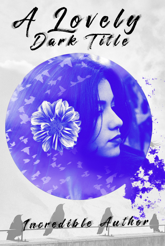
And voila! A pretty cover!
Hope you found this helpful. If you have a particular request for a future tutorial, don’t be afraid to throw it my way!
